Ridian
Brand identity and website for a scheduling platform for teams and companies. From positioning and logo system through to the multilingual site.
The starting point
Kalender-Sync, the product for individual users, had grown into something larger: availability across whole teams, booking of rooms and resources, AI agents that can schedule, and an interface for developers.
That is a different product for a different audience. Someone keeping their own calendars tidy decides in five minutes. Someone choosing scheduling infrastructure for a company checks data protection, permissions and operations, usually with several people involved.
That called for its own identity. Not a second label next to Kalender-Sync, but the brand the platform goes to market under internationally.
A brand that works at both ends
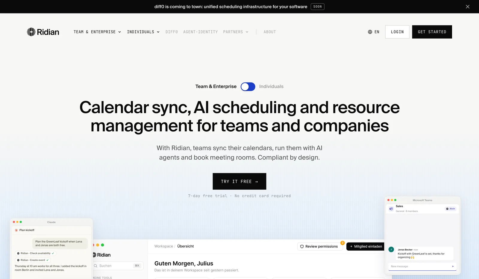
The name Ridian is short, pronounceable across languages, and claims no technical term that would feel narrow in two years. Around it sits a logo system of emblem and wordmark that scales both ways: as a favicon in a browser tab, as a sticker on a laptop, as the header of an invoice.
The colour world stays deliberately restrained. One strong blue as the only signal colour, plus black, white and a grey scale. For a product that displays calendars, that is a practical decision: the interface is already full of coloured events, and a brand with its own busy palette would fight against it.
The result is a complete brand system: logo in every variant, colour and type definitions, imagery direction, templates for social media, ads and email. The design work was done with a design partner; direction and implementation were mine.
The website
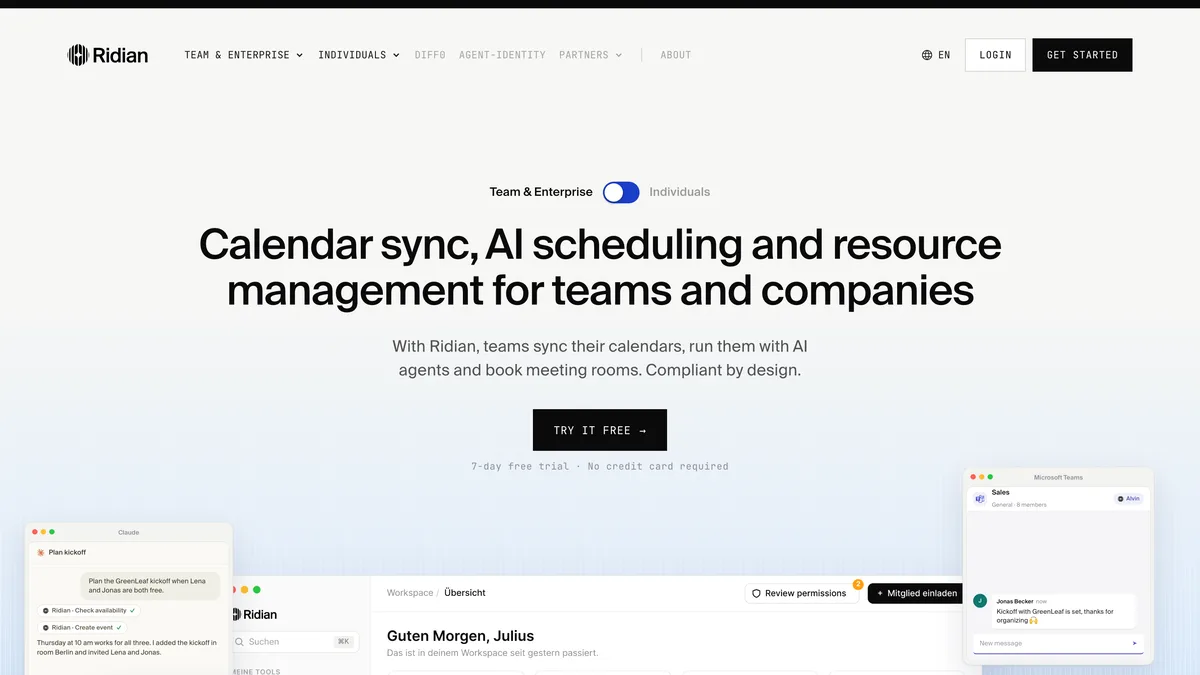
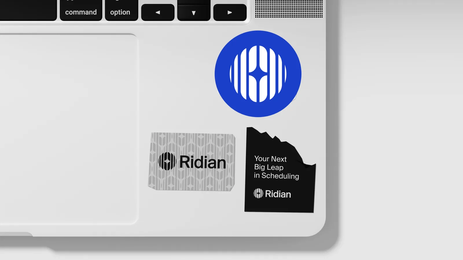
The site had to serve two audiences at once without losing either. That is solved with a switch in the hero: teams and companies on one side, individuals on the other. From there, each group sees a page written for them.
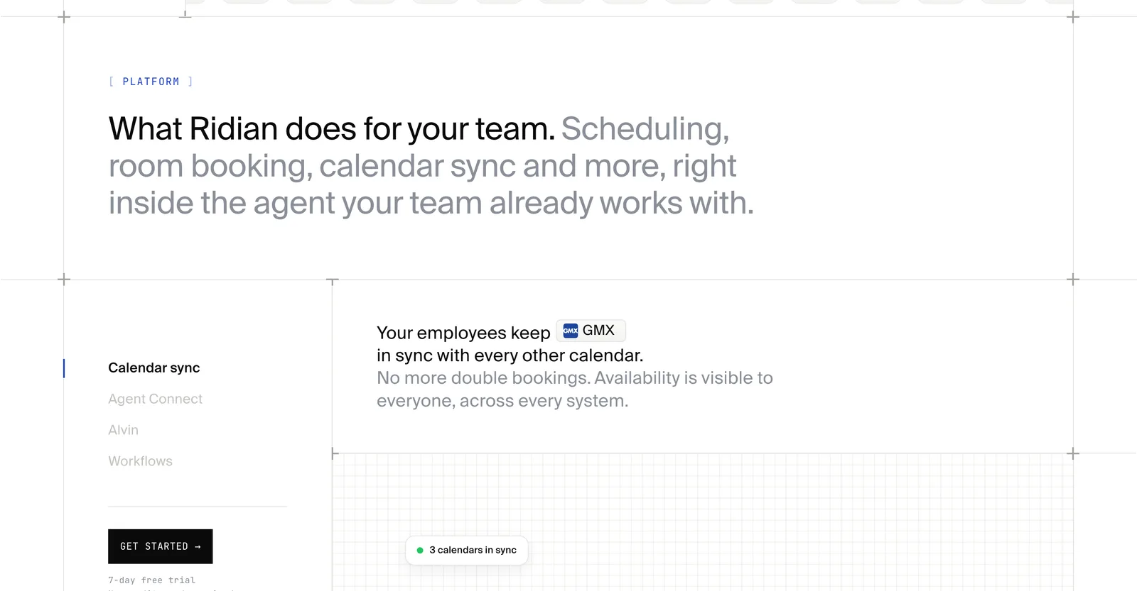
Below that comes no feature catalogue but a series of concrete flows. What happens when two calendars live with different providers. How an AI agent books a meeting without gaining access to its contents. Who on a team can see what. Products like this sell on being understood, not on bullet points.
Technically the site is multilingual and built for short load times, including the groundwork needed later for advertising: a clean page structure, measurement, and a consent banner that loads third-party services only after agreement.
Where it stands
Ridian runs at getridian.com with its own identity for teams and companies and a clear separation from the individual product. Brand and website came out of one project, which is why they fit together: the same colours, the same typefaces, the same language on the site, in ads and in email.